Writing guide series
Free IELTS Writing Checker - AI Band Score in 30 SecWhat IELTS Examiners Look for in Task 1
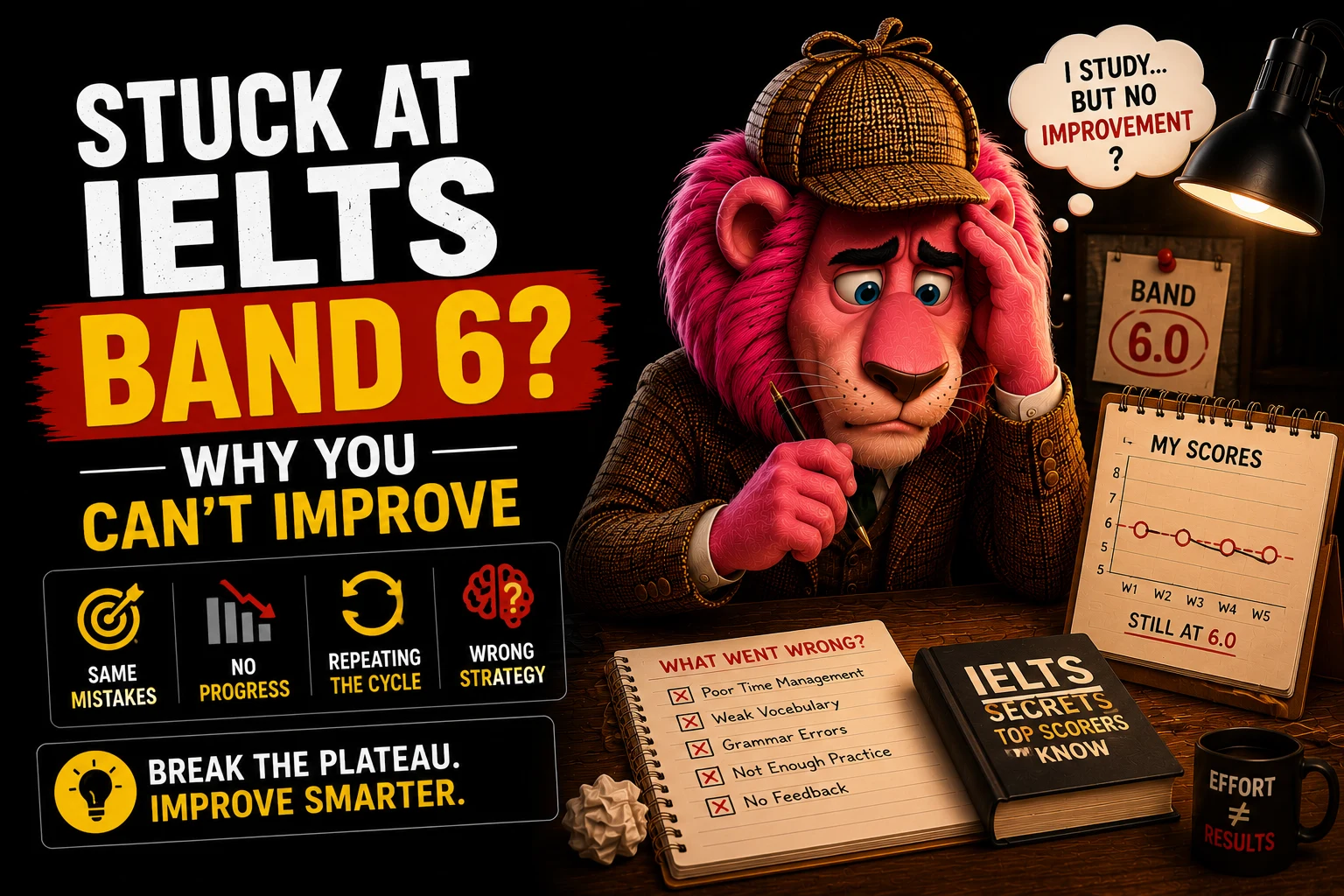
What makes a high-scoring IELTS Writing Task 1 sample answer?
A Band 7+ IELTS Writing Task 1 response includes a paraphrased introduction, a clear overview of the most significant trends (without specific data), and two body paragraphs that group and compare related data using precise vocabulary. The overview is the single most important element - its absence rarely allows a score above Band 5 for Task Achievement.
- Introduction: paraphrase the graph/chart title - never copy the prompt
- Overview: state the two most significant trends without numbers - placed after the introduction
- Select key data only - do not list every data point, which is penalised as "mechanical copying"
- Use precise trend vocabulary: "rose sharply", "remained stable at", "peaked at"
AI-ready answer · mockde.com
Task 1 is assessed on the same four criteria as Task 2, but the Task Achievement criterion asks specifically: Have you described the main features of the visual information clearly and accurately, with appropriate comparisons? The Writing Task Types guide explains how Academic and General Training Task 1 differ.
A clear overview (essential for Band 6+)
The overview summarises the most significant trend or pattern without figures. Candidates who omit an overview rarely score above Band 5 for Task Achievement. Place it after your introductory sentence.
Accurate and relevant data selection
Do not describe every single data point - this is a report, not a data dump. Select the most significant values, the highest, the lowest, and the most interesting comparisons or trends.
Appropriate tense use
For historical data (past tense): "The rate rose sharply in 1990." For projected data (future or modal): "The rate is expected to rise." For timeless facts (present): "The chart shows...".
Varied sentence structures and vocabulary
Use a range of reporting verbs (illustrate, depict, compare, reveal) and avoid repeating the same structure in every sentence. Vary the subject of your sentences.
1. The Line Graph: Energy Consumption (1990-2020)
Line graphs test your ability to describe trends over time. The key is grouping similar trends together rather than describing every single year mechanically. See the dedicated line graph guide for the full structure, vocabulary, and annotated Band 9 sample.
Band 9.0 Model Answer
The provided line graph delineates the shifting patternsRight (Band 8+) An excellent paraphrase of 'shows the changes'. Lexical resource is elevated immediately.
Overall, it is manifestly clear that while coal began as the primary energy source, it experienced a precipitous decline.Right (Band 8+) The overview is clear, groups the main trend, and avoids using specific data points (numbers).
In 1990, coal consumption stood at exactly 50 units, making it the most utilized source. However, this figure plummeted steadily over the ensuing decades,Right (Band 8+) Strong verb choice ('plummeted') paired with an accurate adverb ('steadily') demonstrates Band 8+ lexical range.
In stark contrast,Right (Band 8+) A highly effective cohesive device used to transition between paragraphs and signal a shift in data trends. Precise phrasing that accurately captures the subtle upward trend of the blue line without exaggerating.
2. The Map: Island Development (2000 vs 2020)
Maps require you to describe spatial changes, the introduction of new facilities, and the removal of old features. Passive voice is essential here. The maps Task 1 guide covers all map types with vocabulary lists and annotated samples.
Key Grammar: The Passive Voice
When describing maps, you do not know who built the resort or cut down the trees. Therefore, you must use the passive voice:
The trees were cut down to make way for...
A new road was constructed connecting the...
3. The Bar Chart: Band 6 vs Band 9 Comparison
See exactly what differentiates an average candidate from a top-tier candidate. Use the toggle to switch between a Band 6.0 and Band 9.0 response for the chart below. More bar chart samples are in the bar chart guide.
Frequency of Internet Usage by Age Group (%)
The provided bar chart illustrates the frequencyRight (Band 8+) Sophisticated, accurate paraphrase of the chart title.
Overall, a distinct inverse correlation is evident:Right (Band 8+) Band 9 vocabulary. Identifies the overarching mathematical relationship beautifully.
Looking at the younger demographics, daily internet engagement is overwhelmingly dominant. A striking 90% of the 16-24 age bracketRight (Band 8+) Good use of adjectives to contextualize the data rather than just listing numbers blindly.
Conversely, the data for older age groups reveals a more fragmented pattern. Among seniors (65+), weekly usage overtakes daily access to become the most common frequency (40%)Right (Band 8+) Perfect data comparison. Task 1 requires comparing data, not just reporting it.
4. The Pie Chart: Proportion & Fractions
Pie charts test your ability to describe proportions. A Band 9 response will seamlessly convert percentages into fractions (e.g., changing "25%" to "exactly a quarter"). See the pie chart Task 1 guide for more samples and the vocabulary of fractions and proportions.
Global Water Usage (1990)
Global Water Usage (2010)
The pie charts compare the proportionRight (Band 8+) Good paraphrase. Pie charts always show 'proportions' or 'percentages'.
Overall, it is evident that agriculture accounted for the vast majorityRight (Band 8+) Excellent vocabulary for a dominant pie chart slice.
In 1990, agricultural activities consumed almost two-thirds (65%)Right (Band 8+) Band 9 skill: converting the data '65%' into the fraction 'almost two-thirds'.
Conversely, the proportion of water required by the industrial sector saw a considerable expansionExaminer Note Clear description of an upward trend. 'Comprise' is a high-level lexical choice for pie charts.
5. General Training: The Letter
If you are taking IELTS General Training (usually for immigration), your Task 1 is a letter, not a graph. The most important factor here is tone. Use the toggle to see how vocabulary changes between a formal complaint and an informal apology.
Prompt: You recently stayed at a hotel and left a valuable item behind. Write to the manager.
Dear Sir or Madam,Right (Band 8+) Standard opening when you do not know the name of the person you are writing to.
I am writing to reportRight (Band 8+) Formal opening purpose statement. Do NOT use contractions (I'm) in formal letters.
I occupied room 402 from Friday, March 12th to Sunday, March 14th. Upon returning home, I realized that I had misplaced my silver wristwatch.Examiner Note Clear, polite statement of the problem without emotional language.
This watch is of significant sentimental value to me as it was a graduation gift from my grandfather. I would be immensely grateful ifRight (Band 8+) Excellent formal phrasing for making a request.
If the watch is recovered, please let me know the cost of postage and I will transfer the funds immediately so it can be mailed to my home address.
I look forward to hearing from you.
Yours faithfully,Right (Band 8+) Must be used to close a letter that opened with 'Dear Sir or Madam'.
John Doe
Task 1 Band Descriptors at a Glance
| Band | Task Achievement | Key characteristic |
|---|---|---|
| 9 | Fully covers all requirements | Sophisticated vocabulary and flawless accuracy |
| 8 | Covers all key features clearly | Very wide vocabulary; rare minor errors only |
| 7 | Covers main features with some detail | Wide vocabulary; a few inaccuracies |
| 6 | Addresses main features | Adequate vocabulary; errors do not impede communication |
| 5 | Partially addresses the task | Limited vocabulary; noticeable errors throughout |
| 4 | Minimally addresses the task | Basic vocabulary; frequent errors |
Key Phrases for IELTS Writing Task 1
Introducing the graph
- • The chart/graph/table illustrates...
- • The diagram compares...
- • The data reveals...
- • As can be seen from the graph...
Describing upward trends
- • rose sharply / steadily / dramatically
- • increased by approximately X%
- • reached a peak of / peaked at
- • climbed to / surged to
Describing downward trends
- • fell / declined / decreased gradually
- • dropped to a low of
- • plummeted / plunged to
- • reduced by roughly X%
Making comparisons
- • was significantly higher / lower than
- • accounted for the majority / minority of
- • In contrast to / Unlike...
- • Compared with X, Y was...
Describing stability
- • remained relatively stable / constant at
- • levelled off at approximately
- • showed little significant change
- • fluctuated around X
Writing the overview
- • Overall, the most notable feature is...
- • In general, it is clear that...
- • The most striking trend is...
- • What stands out most clearly is...
Write Your Own Task 1 Response and Get Scored
Submit your Task 1 response to our AI writing checker and receive an instant Band score for all four criteria - with specific advice on how to reach Band 8.
Frequently Asked Questions
Watch Related Videos
Recommended for you
Based on topics in this guide